
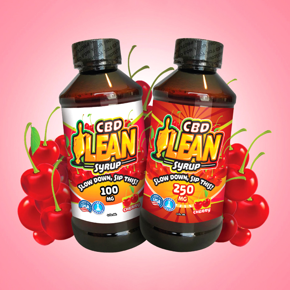
CBD Lean: Brand Identity and Packaging
A visually bold, high-impact brand identity for CBD Lean, built to stand out in retail and trade show environments with vibrant packaging and modern aesthetics.
Framing the Challenge
Experience CBD approached us to create a sub-brand identity for their unique CBD-infused beverage, CBD Lean. The challenge was to capture attention in both retail and trade show environments, balancing clean visuals with energetic design that felt modern, trustworthy, and appealing to a broad audience.
Key Objectives
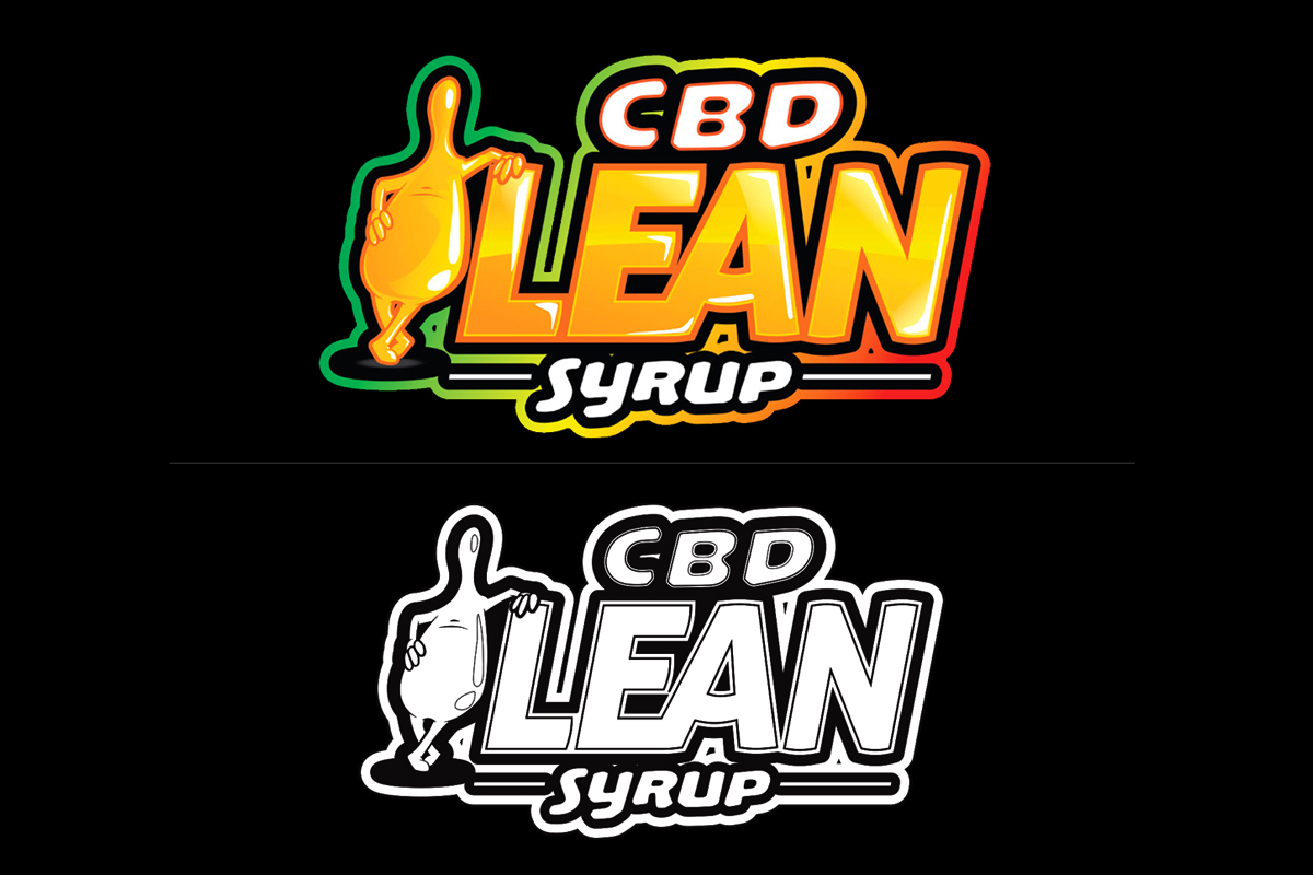
- Develop a strong logo and identity for CBD Lean under the Experience CBD umbrella
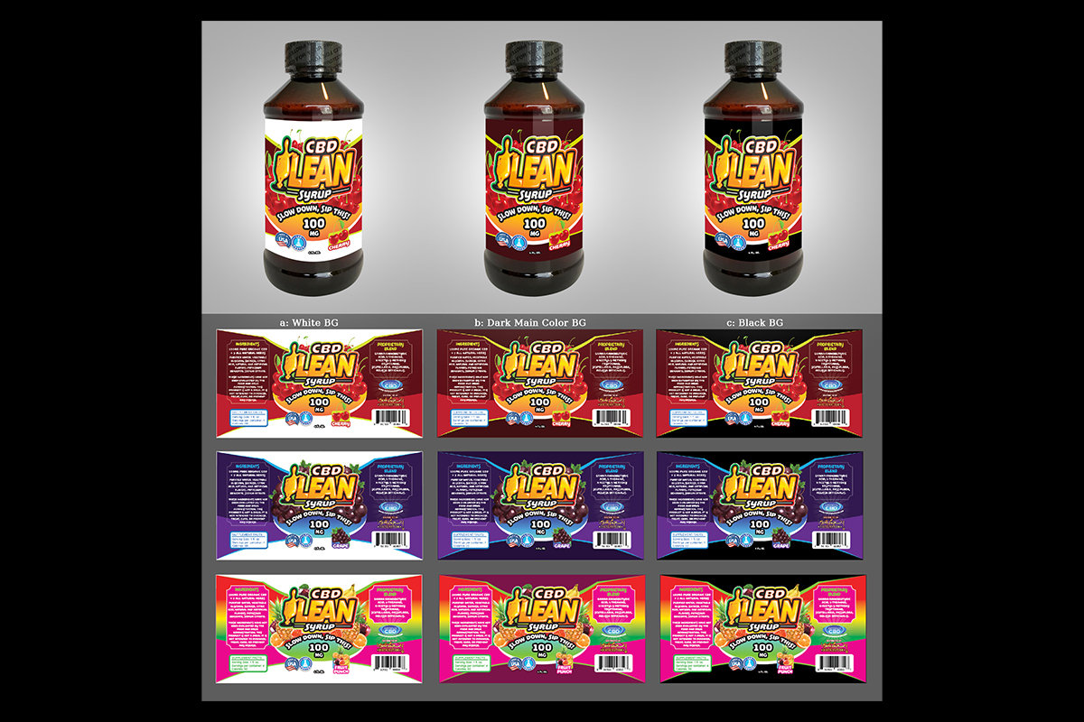
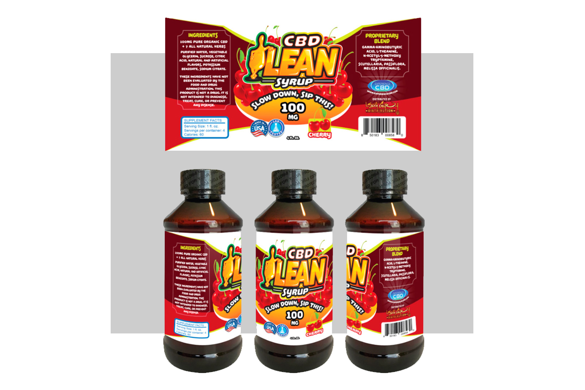
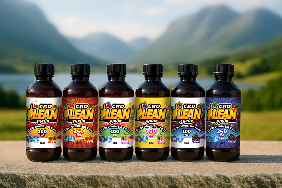
- Create high-impact packaging and product labels for multiple flavors
- Design trade show materials that reinforce brand recognition
- Ensure brand consistency across digital and print media
Crafting the Solution
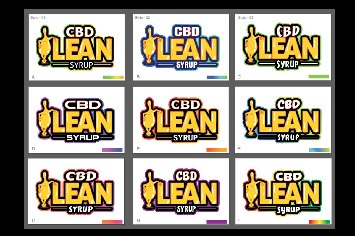
Working closely with Leeron Galimidi, we went beyond simple mockups to deliver layered brand thinking, blending sharp layouts, vibrant gradients, and product-focused visuals. Our work extended into magazine ads, event signage, packaging, and cohesive systems that helped elevate their presence across all platforms.
Real Results
The CBD Lean identity became a standout visual within Experience CBD’s product ecosystem. With glowing reviews from trade shows and resellers alike, the branding contributed directly to their growth. From eye-catching bottles to consistent marketing, the identity system helped propel the brand from small startup to serious player.
The REDXEL Impact
Our design partnership played a pivotal role in launching and scaling CBD Lean. The designs not only attracted attention but also built credibility. Feedback from events and customers alike highlighted how the branding made them feel confident in the product’s professionalism and appeal.
What We Delivered
- Logo and Sub-Brand Identity for CBD Lean
- Full Label Set for Product Lineup (Multiple Flavors)
- Magazine Ad Designs and Print Campaign Assets
- Event & Trade Show Signage Templates
- Packaging Layouts & Digital Product Mockups
- Production-Ready Assets (Print & Digital)