

CBD Cuisine: Logo Design
A pig character mark for CBD Cuisine built from layered, bacon-slice-style body segments and topped with a crossed fork and knife, paired with a flowing script "Cbd Cuisine" wordmark, developed across a black-and-white utility system and a gold premium treatment.
Framing the Challenge
CBD Cuisine needed a distinctive character mark that read clearly as a food and culinary brand, worked as a small icon as well as a large premium mark, and could move between a plain black-and-white utility version and a richer gold presentation version.
Key Objectives
- Build a pig silhouette from ribbon-like layered segments so the body itself reads as sliced or portioned food
- Top the silhouette with a crossed fork and knife, using a small curling line to double as both a steam wisp and the flourish of a chef's garnish
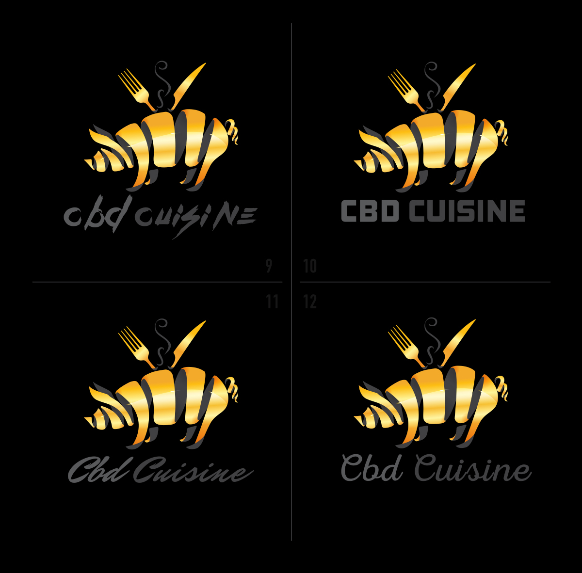
- Pair the character with a flowing script "Cbd Cuisine" wordmark, tested against several other typography directions first
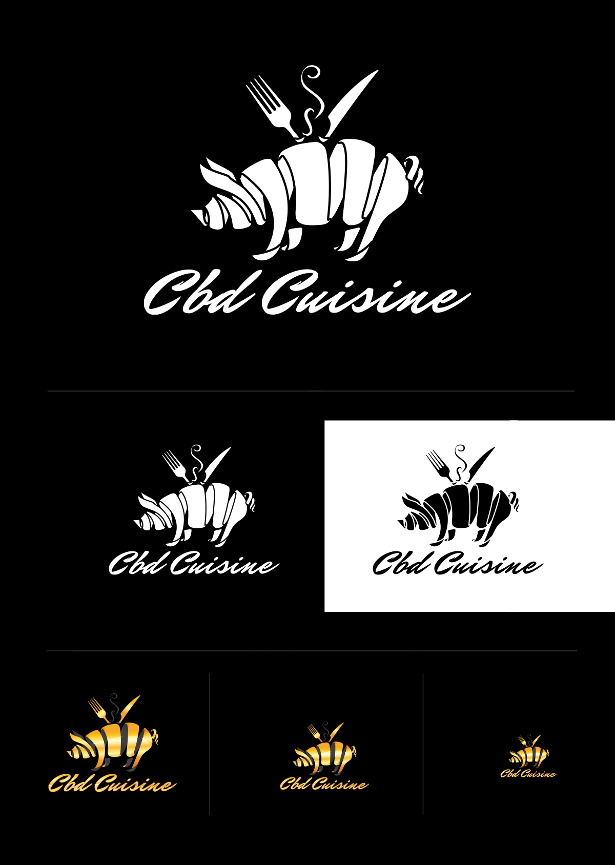
- Deliver the mark as a full black-and-white identity system, including positive, reverse, and small-scale versions
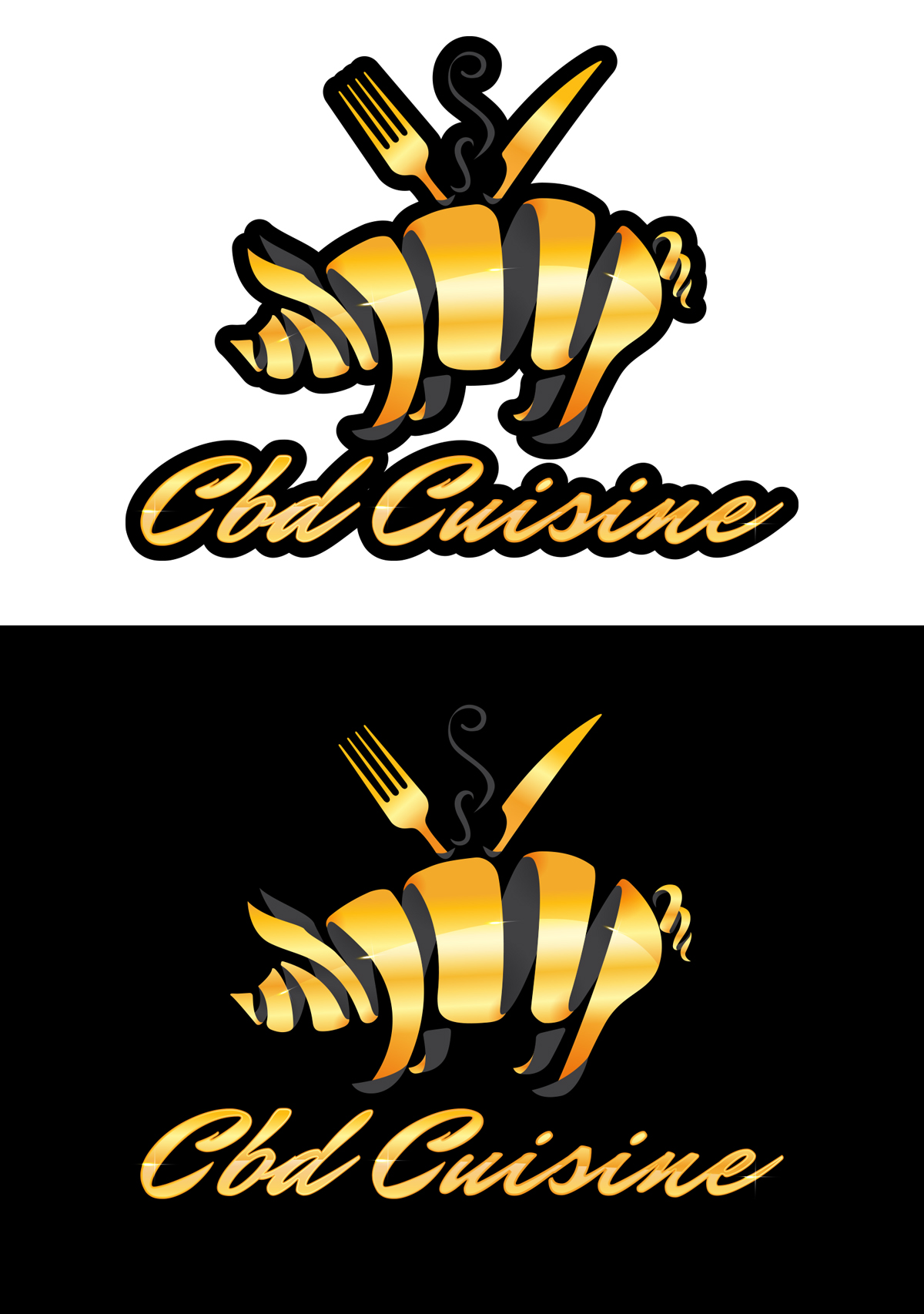
- Develop a gold, outlined, premium version of the same mark for tabletop and apparel presentation
Crafting the Solution
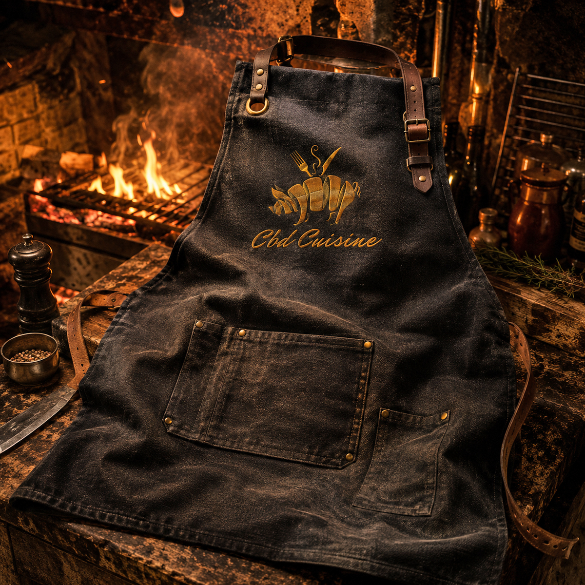
REDXEL developed the CBD Cuisine mark around a culinary pig icon built from sliced, ribbon-like segments, with a fork, knife, and steam detail reinforcing the food-service direction. The process moved through several wordmark options, including rough lettering, block typography, and script variations, before settling on the flowing script lockup. The gallery shows the identity tested in black-and-white, gold gradient, dark-background, light-background, and small-scale versions to make sure the mark stayed readable across different uses. The final presentation then places the logo into branded culinary scenes, including tabletop details, a business card, glassware, a coaster, cork, seal, and a kitchen apron mockup.
Real Results
The image sequence documents a complete identity system for CBD Cuisine: a black-and-white utility version of the pig-and-cutlery mark for everyday use, a gold premium version for tabletop and apparel presentation, and a script wordmark carried consistently across every variant after a documented round of typography exploration.
The REDXEL Impact
The portfolio presentation shows how the CBD Cuisine mark extends across a black-and-white utility system and a gold premium treatment, from small-scale icon use through tabletop touchpoints and kitchen apparel, without relying on any single fixed color or background.
What We Delivered
- Primary gold logotype with black keyline, striped body shading, and highlight detailing
- Black-and-white positive (white lockup) and reverse (black-on-white) identity versions
- Reduced small-scale versions for icon and stamp-size legibility testing
- Typography exploration sheet comparing four wordmark directions
- Tabletop brand presentation scene across glassware, coaster, cork, wax seal, and business card
- Kitchen apron mockup with embroidered gold mark