

Fortuitous Jam: Logo & Label System
A complete logo and label system for Fortuitous Jam, an artisan jam brand built around a hand-painted feel, natural ingredients, and personality. The mark pairs a hand-drawn daisy illustration with expressive hand-lettered typography, then extends across multiple logo variants and product jar labels.
Framing the Challenge
Fortuitous Jam needed a brand identity that felt as handcrafted and personal as the product itself. The logo had to carry warmth and authenticity without looking unprofessional, working cleanly on product labels, print collateral, and digital formats while expressing the small-batch, nature-forward ethos of the brand.
Key Objectives
- Design a logo mark that communicates artisan quality, natural origins, and approachability
- Build a versatile system with multiple logo configurations for different product and marketing uses
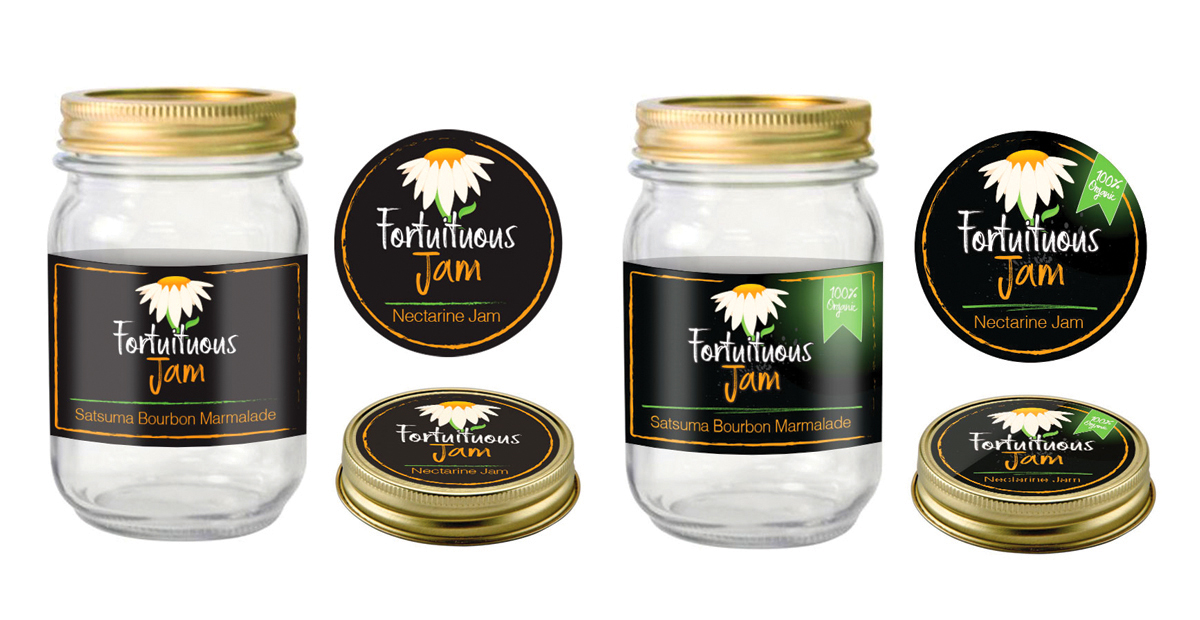
- Develop jar and lid labels that match the brand voice and function as print-ready packaging
- Produce a clean black-and-white version for embossing, deboss, and single-color print applications

Crafting the Solution
The primary mark combines an illustrated daisy, evoking nature and small-batch production, paired with layered hand-lettered type: "Fortuitous" in casual script above and "Jam" in a bolder brushstroke below. The full system was developed with and without decorative dot borders, with and without the outer border ring, and in both full-color and monochrome. This matrix of variants covers every likely use case without requiring a redesign. The same identity was extended into jar and lid label formats sized and structured for print production.

Real Results
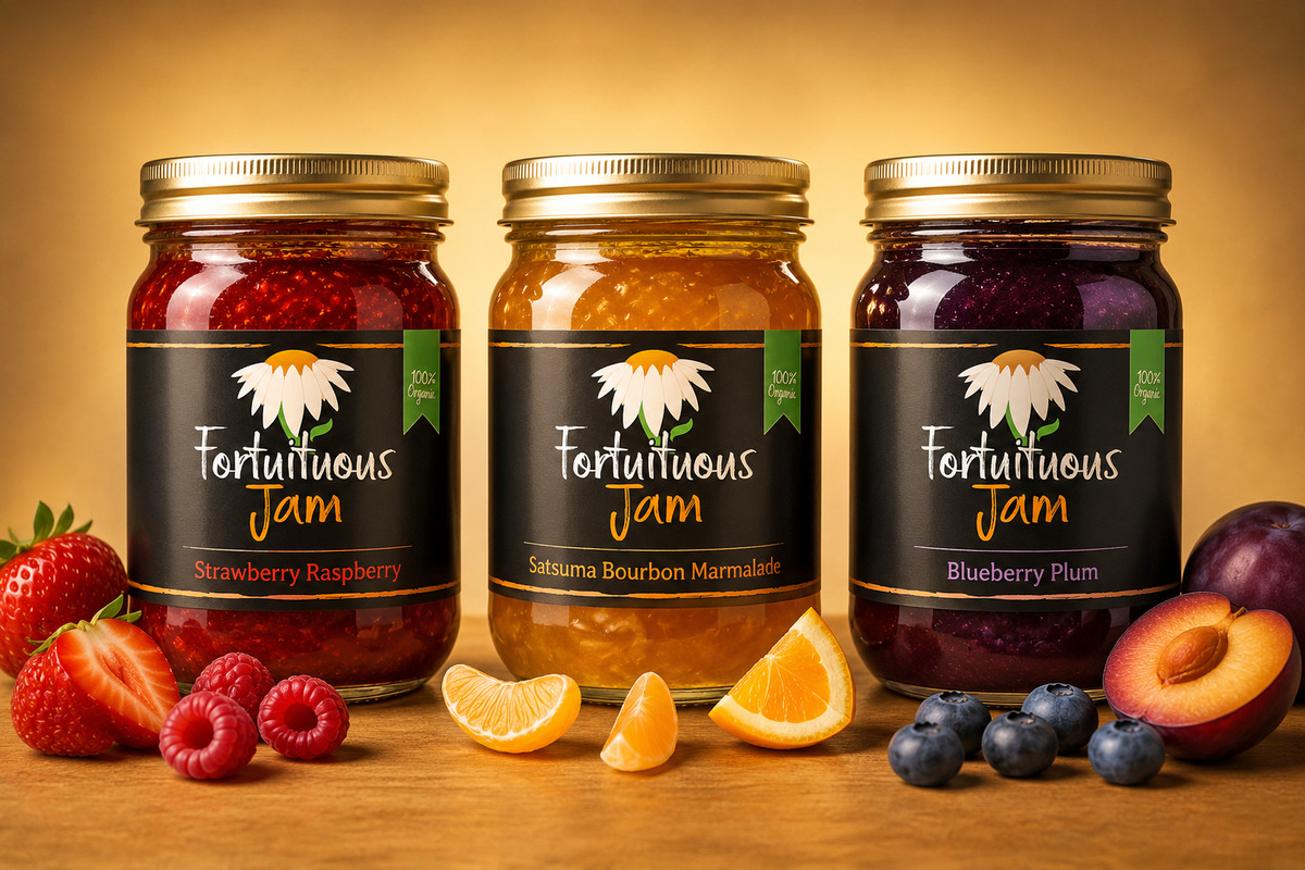
The final system includes six logo configurations covering every combination of dots, border, and color treatment, plus a dedicated black-and-white version. Jar labels (Fresh, NoTag, Organic flavors) and lid labels complete the packaging suite. Every file was delivered in vector format ready for commercial printing.

The REDXEL Impact
Fortuitous Jam launched with a brand identity that looks artisan and intentional at every touchpoint, from the jar on the shelf to social media and printed marketing. The six-variant logo system gives the brand flexibility to grow without needing future redesign.
What We Delivered
- Primary logo: full color with dots and border
- Five additional logo variants (dot/no-dot, border/no-border, BW)
- Jar labels: Fresh, NoTag, and Organic flavors
- Lid labels: Fresh, NoTag, and Organic
- Vector master files (AI, EPS) and web-ready PNG exports