
Lopez Pest Control PR: Logo Redraw
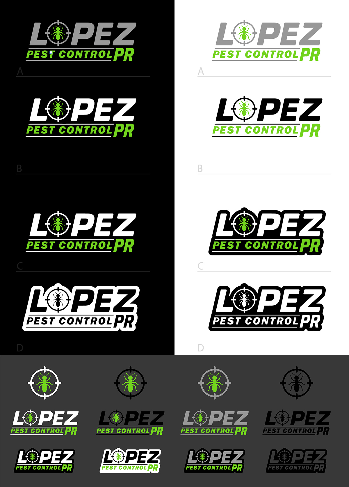
A rebuild of the Lopez Pest Control PR ant and crosshair mascot as clean vector artwork, delivered as twelve ready-to-use icon, logo and framed versions in four colorways, and previewed on a work truck and on uniform and equipment.
Framing the Challenge
Lopez Pest Control PR is a pest control company in Puerto Rico. Its owner already had a mascot he liked: an ant inside a targeting crosshair, which says what the company does at a glance. The problem was the file. The logo existed only as a flat image, which softens when enlarged, breaks down at icon size and cannot be recolored cleanly for a dark truck door or a white invoice.
The company needed the same idea rebuilt as proper vector artwork, with the full name readable at every size, plus the versions it would actually use on trucks, uniforms, cards and a phone app.
Key Objectives
- Keep the owner's idea: the ant inside the crosshair stays the heart of the brand
- Redraw the mascot and lettering as clean, scalable vector artwork
- Make the full name read clearly at every size, from a truck door to a small icon
- Prepare color versions for black, white and grey backgrounds, plus black and white
- Show the logo in realistic use before anything is printed
Crafting the Solution
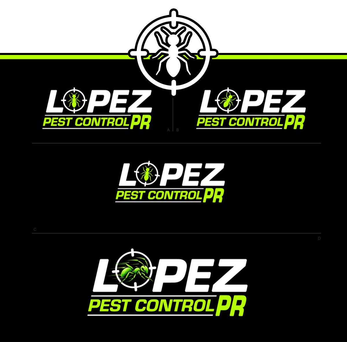
Rebuilding the mascot. The ant, the target ring and the heavy outlined lettering were redrawn from scratch as separate vector shapes, so every curve stays sharp at any size. The stroked, slanted wordmark keeps LOPEZ legible on busy surfaces like a truck side or a uniform.
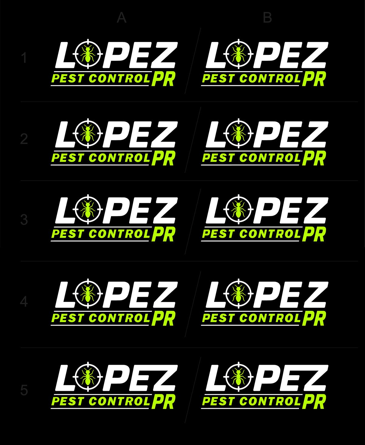
Options first. Several layouts were shown together in a numbered grid, so the owner could compare them side by side and choose before the final design was refined.
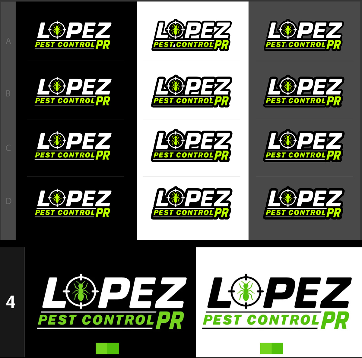
Color and form. The brand runs on lime green against black or white, prepared in white and green, black and green, grey and green, and black and white for single-color jobs. Each colorway comes as an icon, a full logo and a framed logo: twelve versions, shown together on one sheet.
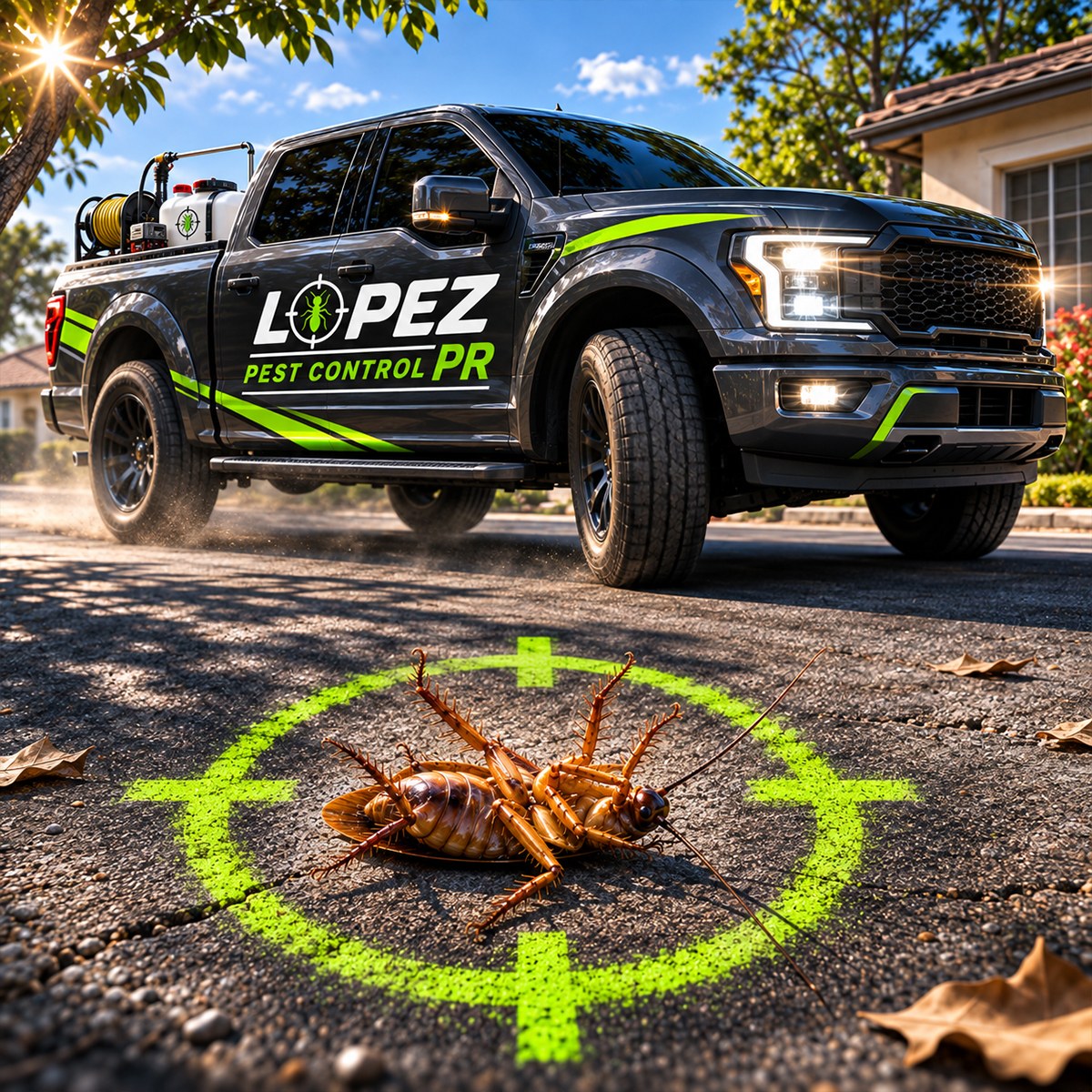
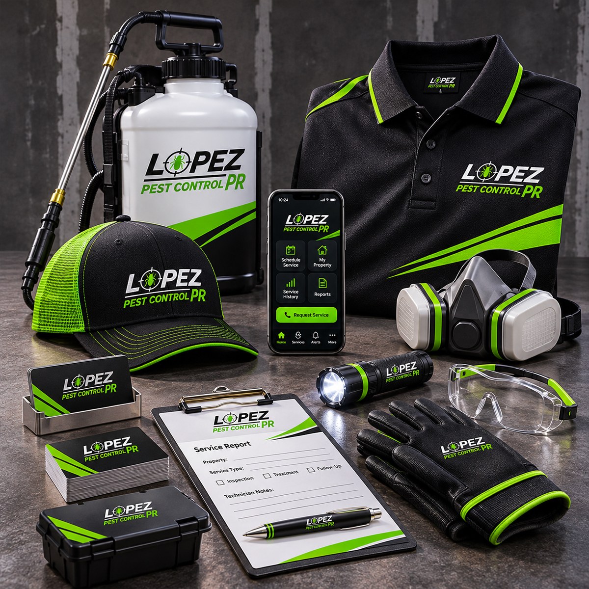
Seeing it in use. Two concept mockups preview the identity: a pickup truck carrying the logo, and a flat-lay of a cap, polo shirt, sprayer, gloves, clipboard and phone app. They are mockups, not photos of finished products.
Real Results
The company received a complete vector logo system: the redrawn mascot, twelve versions in four colorways, clean presentation sheets and concept mockups on a truck and on uniform and equipment. The artwork is delivered as scalable vector files with matching image versions, so a print shop or sign maker can start from the right file every time.
The REDXEL Impact
This project shows how REDXEL approaches brand identity for a working local business: keep what already works, rebuild the file properly, and deliver the versions the business will really use. The truck and equipment images are concept mockups created by REDXEL to preview the identity.
What We Delivered
- Vector redraw of the ant and crosshair mascot
- Four icon versions
- Four logo versions
- Four framed logo versions
- White and green, black and green, grey and green, and black and white colorways
- Numbered layout options sheet and full presentation sheets
- Concept mockups: work truck, and uniform and equipment
- Scalable vector files with matching image versions