
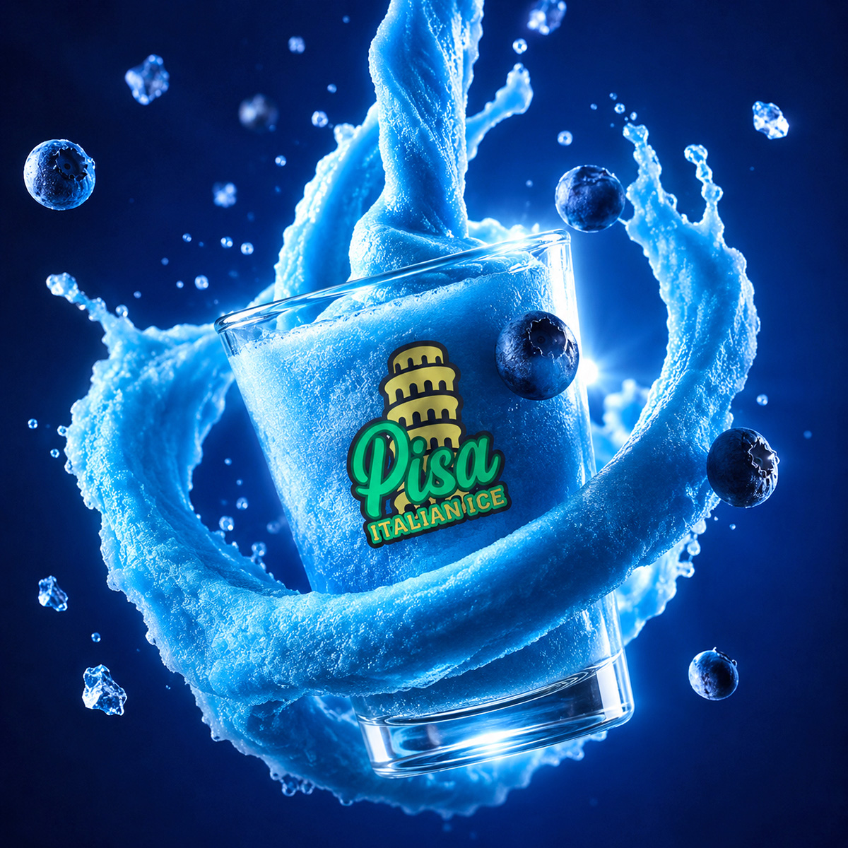
Pisa Italian Ice: Brand Identity and Logo Design
A bold brand identity for an Italian dessert shop, emphasizing playful elegance and smart color contrast.
Framing the Challenge
Pisa Italian Ice needed a unique, recognizable brand identity for a new dessert concept that balances tradition with vibrant visual energy. The main challenge was making the Pisa Tower an iconic element while still preserving legibility and versatility across packaging and signage.
Key Objectives
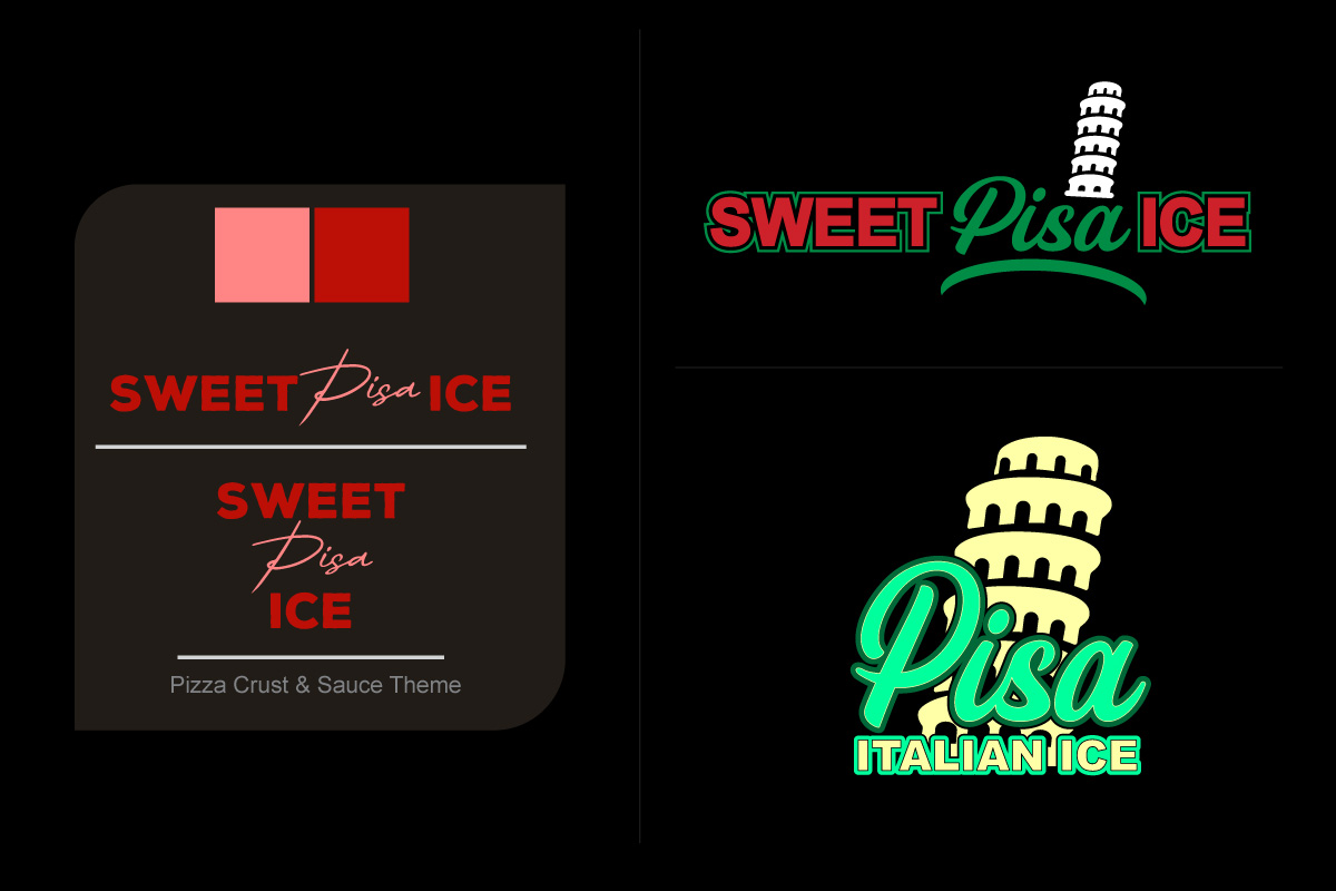
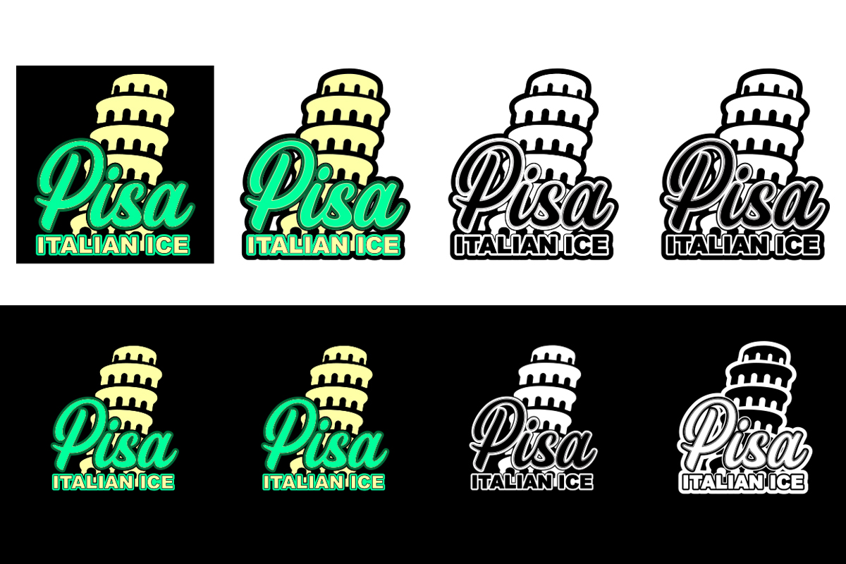
- Design a flexible logo system with color and black & white variants
- Emphasize the word “Pisa” in a vibrant tone to stand out visually
- Ensure strong legibility and visual appeal across light/dark backgrounds
- Deliver production-ready files for print and digital assets
Crafting the Solution
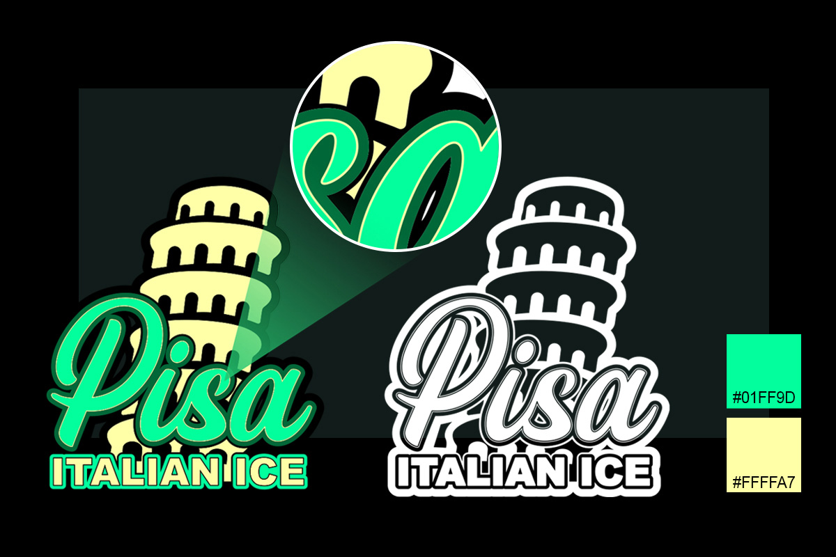
We explored multiple layout and color variations, working closely with the client to study visual balance, contrast, and emotional tone. The process included font pairing studies, icon refinement, and progressive enhancements of the Pisa tower illustration to fit the tone and scale of the brand.
Real Results
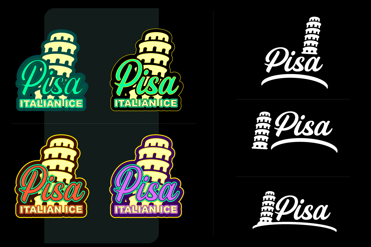
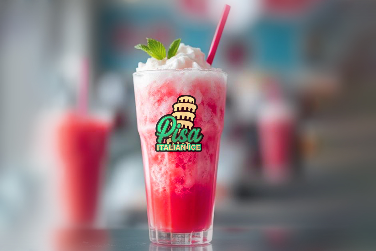
The final design introduced a customized Pisa Tower icon with modern soft edges and clean geometry. The approved logo blends nostalgia with fun, helping Pisa Italian Ice stand out in both retail and mobile dessert carts. Approved variations allow adaptability across packaging, signage, and merchandise.
The REDXEL Impact
Our involvement went beyond deliverables: we shaped clarity, built momentum, and crafted assets that elevated their brand. The result wasn’t just a design system, but a creative shift they could own and evolve.
What We Delivered
- Primary Logo in Color, Black and White & Single Color
- Brand Icon (Vector & Print Optimized)
- Full Logo Package (Vertical, Horizontal & Icon Only)
- Brand Kit Specs with Font Suggestions and Pairings
- Vector Formats: .AI, .PDF, .SVG & .EPS
- Raster Formats: .PNG at 72, 150, 300 & 600 PPI