
Quezada Architecture: Logo Design
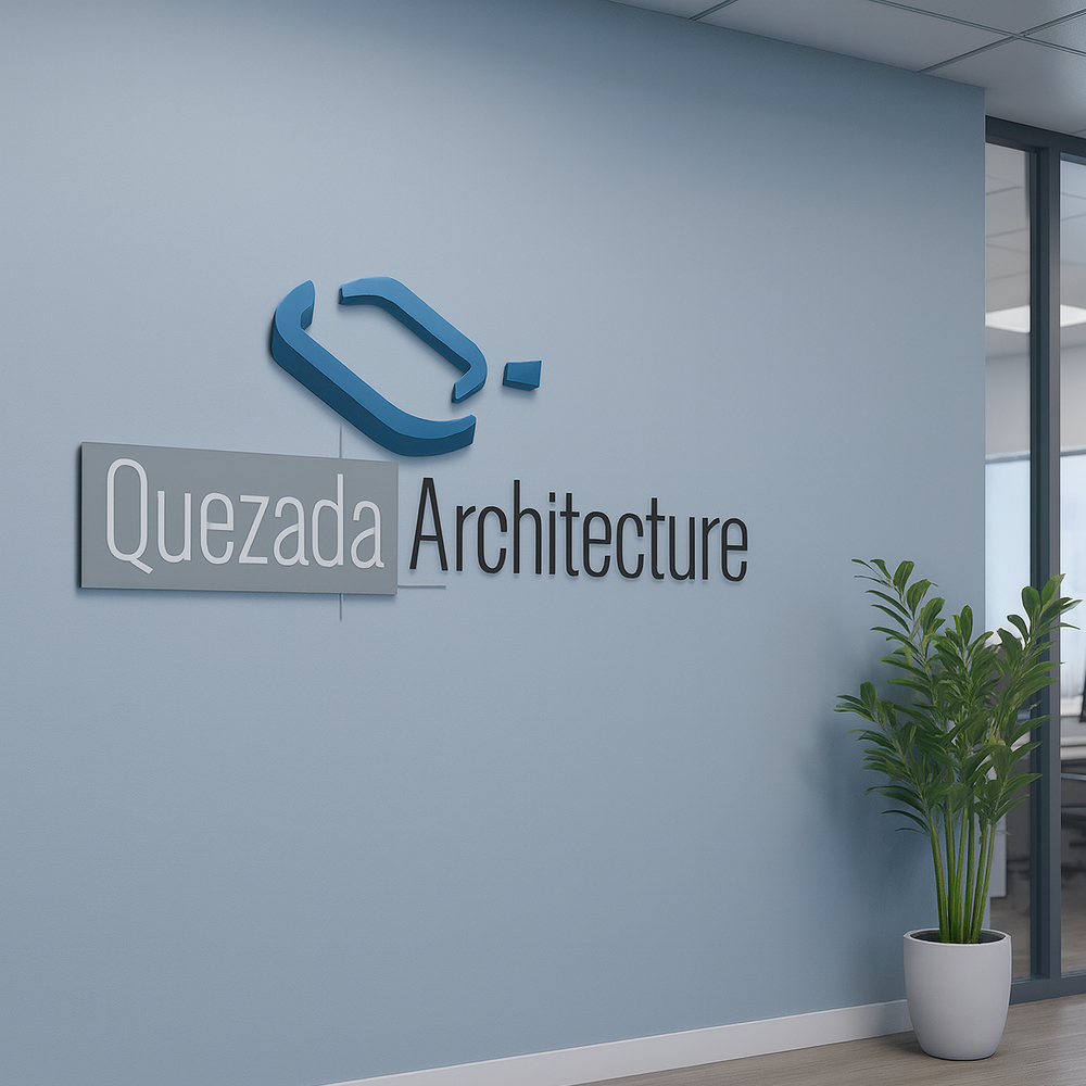
Logo design for Quezada Architecture, a minimal yet structured mark created to reflect the professional identity of an architectural firm. The result balances structure and clarity, with a geometric emblem and elegant font combination.
Framing the Challenge
The client needed a clean, modern logo that emphasized the architect’s name while subtly evoking structural design elements. The mark had to be unique, legible at various sizes, and suitable for both print and digital applications.

Key Objectives
- Create a recognizable logo incorporating the letter Q as a structural metaphor
- Maintain legibility and elegance suitable for architectural branding
- Ensure scalability for letterheads, websites, and printed collateral
Crafting the Solution
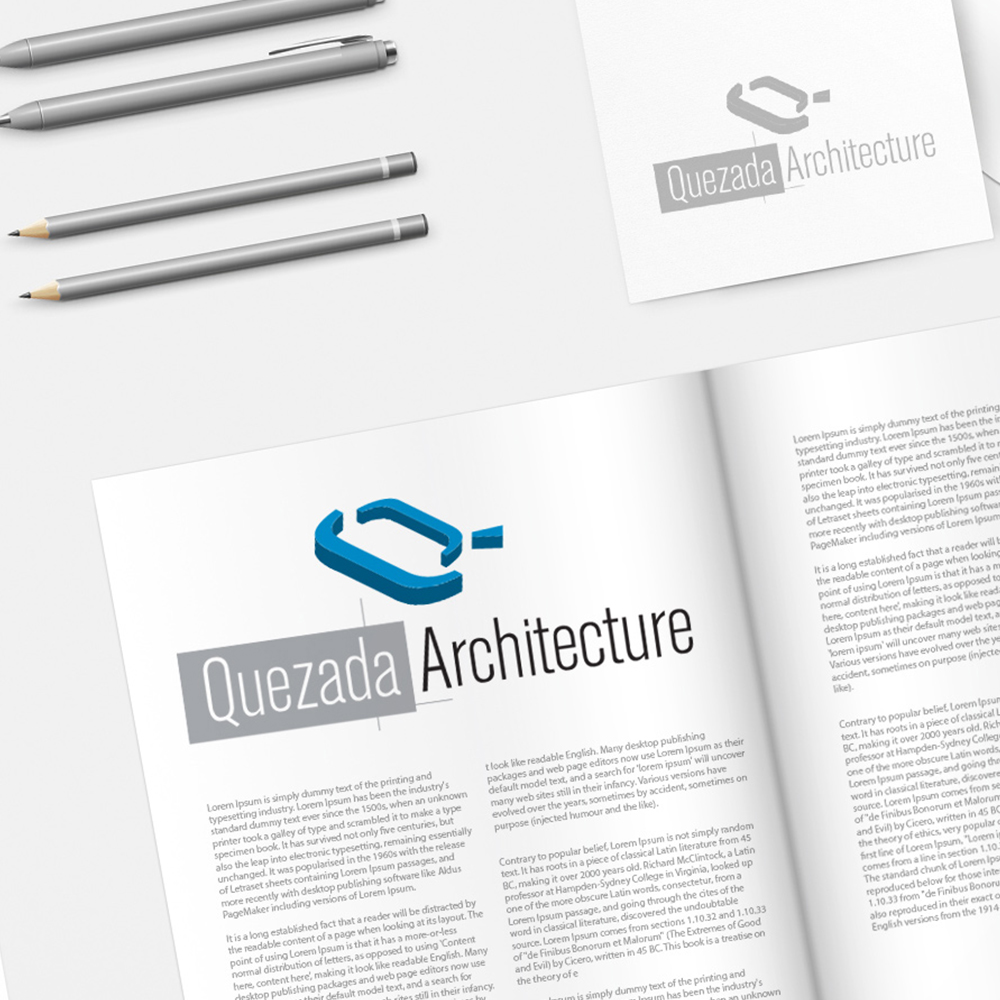
The logo focuses on a stylized "Q" designed to resemble a 3D architectural structure. A modern sans-serif font was paired with a subdued gray background to highlight the firm’s name, while keeping the composition clean and professional. Designed entirely in Adobe Illustrator to ensure vector scalability.
Real Results
The final design provides a distinctive yet restrained identity for Quezada Architecture, suitable for professional stationery, marketing materials, and digital use. It clearly communicates a refined, design-focused brand ethos.
The REDXEL Impact
The logo helped establish a modern, polished brand identity for the firm and has since been applied consistently across printed materials and digital presentations, reinforcing the company’s professionalism and creative focus.
What We Delivered
- Custom Q Monogram Design
- Typography and Color Pairing
- Stationery & Mockup Assets
- Vector and Raster Logo Files (AI, PNG, JPG)